
Helping Canada’s government communicate data
Data-based decision in government is a great idea. But remember, it’s not just about the data. It’s also about how you present that data.

Brand spanking new Canadian Prime Minister and devilishly handsome guy, Justin Trudeau, made big news by announcing a diverse cabinet that “looks like Canada.”

Being extremely impressed by such an impactful start, I wanted to learn more about Trudeau. I thought I’d flex my journalistic muscle and dig in. So I went to Twitter. It turns out the man has ideas so big he has to say them in English and French. Though my experience is that non-English translations always have something extra.
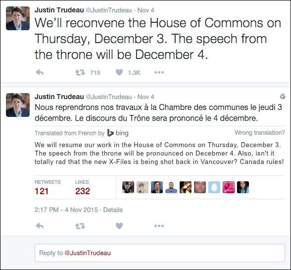
Anyway, looking through his feed, I found this rather interesting tweet.
The mandatory long-form #census will be back in time for next year. It’s time to restore data-based decision making to government.
— Justin Trudeau (@JustinTrudeau) November 5, 2015
Data-based decision making in the government? This seems like a great idea, but I hope that Trudeau remembers that it’s not just about the data. It’s also about how you present that data. Fortunately, Canada is next to the greatest country of all time — the US of A, a global leader in communicating government-related data. Let’s take a look.
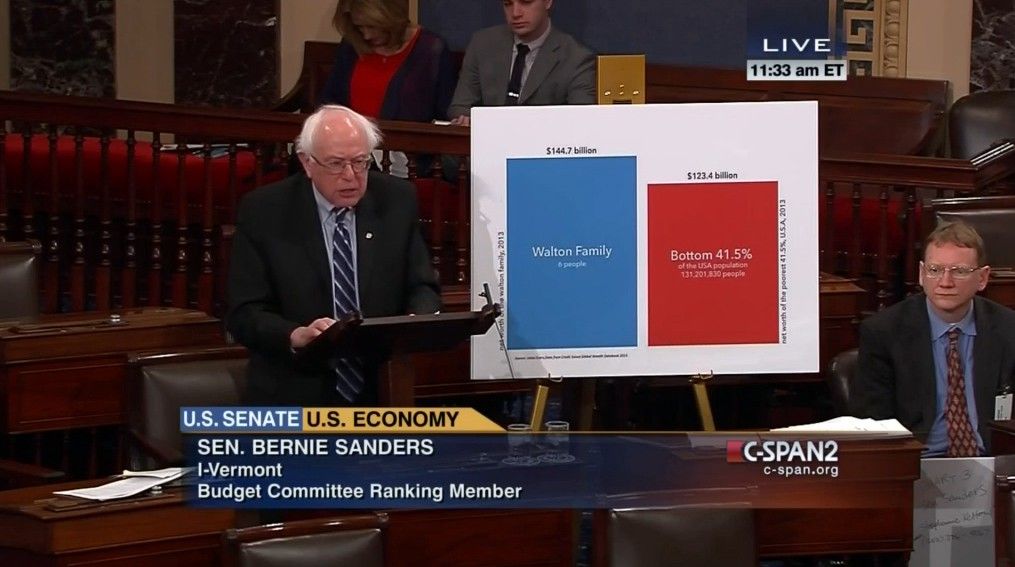
This is a nice straightforward piece of data visualization. We don’t even need to hear what Presidential-hopeful, Bernie Sanders, is saying to see clearly the ridiculous wealth inequality he’s talking about. And the decision from this data is just as clear that the government needs to get involved in cleaning up this huge mess. Unless your last name is Walton, then the decision is, “wait, there’s another $123B sitting around? We need to get us some of that.” Moving on…

Sometimes, you don’t have access to fancy “computers,” that run fancy “Microsoft Office, which was created 25 years ago.” No worries, you can get scrappy and just handwrite numbers on a giant pad behind you. The numbers can mean something or they don’t have to — up to you. Whatever just feels right. Pocan is a pretty progressive dude so maybe someone get him a damn laptop already.
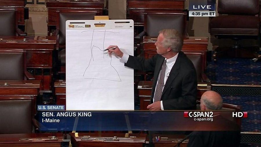
And hey, maybe numbers take too long to write. There’s an old storytelling technique, “show don’t tell.” In this case, Senator Angus King is showing everyone how he puts his shirts (tops?) on every morning — with arms thrown up in the air as if he just doesn’t care. You go, King.
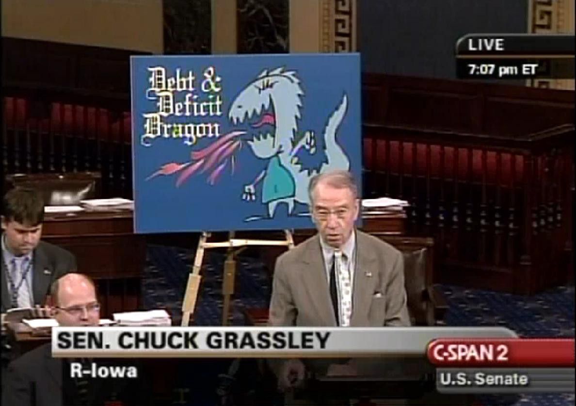
Sometimes, it’s just helpful to use a simple image that quickly summarizes the data and the point you are trying to make. Also, it’s very important that you know your audience. Make sure to communicate your content in a way that is relatable to them, based on their age, maturity, etc. It will really help make your point impactful.
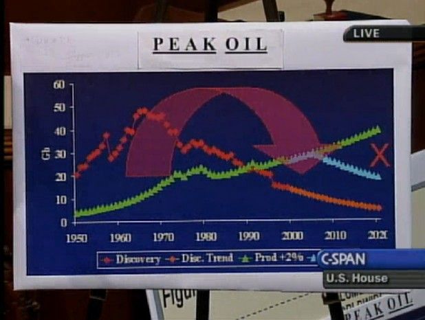
Now if you do have access to powerful data analysis and presentations tools, make sure to go all in. This is a very easy to understand summary of how oil, potentially measured in gigabits, has changed in some way (or ways) across various characteristics of some sort over several decades. Most compelling is the giant purple arrow, which obviously represents time travel via a wormhole. And as we all now know, a wormhole is created when The Flash collides with a hydrogen proton while running at Mach 2 in Central City’s particle accelerator. No big deal. Clearly, this distinguished congressional representative just gets it. And now, anyone with a pair of eyes can just get peak oil.
So hopefully, Trudeau will follow the US’s lead in analyzing and communicating data in order to make the best decisions for his people. And if he needs any help, he needn’t worry. We can teach it to anyone.